We know every designer and developer spend his precious hours for searching to find out smart techniques to complete his job bit easier. Here, we are going to learn some really useful and time saving solutions that we’ve stumble upon especially to help web developers and web designers. Interestingly, these solutions not only help you with coding part but enhance a website’s design as well result in a more usable and interactive website.
These smart and effective tricks and techniques created by top web designer and web developers to make their work easier. With the help of these techniques, approaches, examples, tricks and hacks, you can make a dull static website really effective that not convey right business message but delights your users. Interestingly, these different techniques can be easily applied by developers and designers to make their website more user-friendly and usable to provide a richer user experience. Let’s get started:
1. Bar Graph Effect
Here, we are going to talk about an amazing effect (pictured below) to add more dynamism to particular web page and make it user-friendly. The trick is to organize set of items available on a page like tags, categories, comments, product count to enhance user interaction by using content clues to overall improve usability. This allow user to quickly figure out what a website consists simply by viewing the count of items.
Below, the left picture – Dribbble (number of tags) and right picture – Engadget (most commented posts).
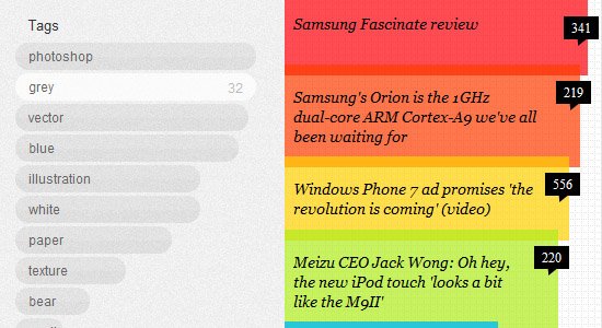
Here, highlighted commented posts meant for user-to-user interaction. In the left design, tags are organized and second example of design indicates ranks of the most commented posts. You need to do below mentioned three things to create bar graph effect for multiple items :
List out the full list of features
First of all, list the different steps involved in writing to get stated with it which further sort out in coding terms.
- Pull number count of items like – tags, comments, category count, etc. dynamically
- Arrange list of items with the highest count
- Create horizontal/ vertical bar corresponding to the count of items
- Organize the bars according to quantity.
Recreating effect for design in HTML and CSS (Statically) :
Here, we are going to create effect simply by using plain HTML and CSS languages. Check out the below codes :
The (X)HTML:

The CSS:

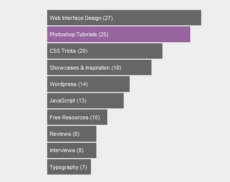
See the results for above mentioned set of codes used to create this static mock-up :
Recreating the effect for design dynamically
Now, we have to pull the codes from database and organize them automatically to create the bars. Below, we are going to discuss an example. In this example, we are going to work here with the number of posts in WordPress categories. See the below codes:
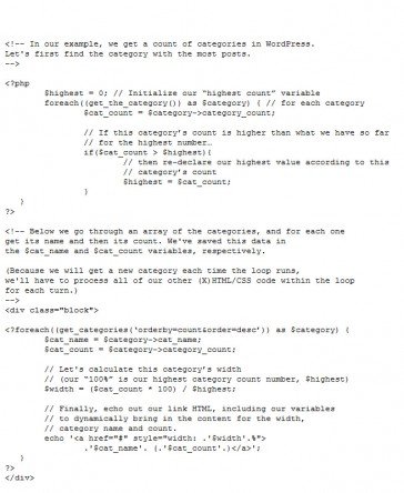
See the Demo of the above example and you can even Download the Files.
2. On-Page Text Search
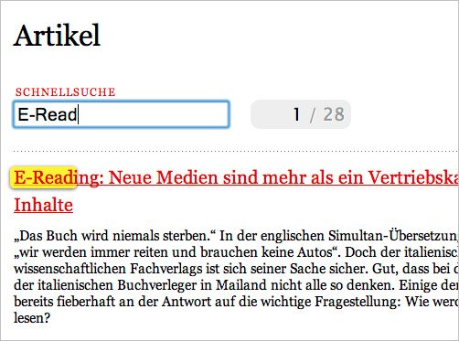
Now-a-days, most of the websites have search boxes that allow visitors to easily and quickly find content across the website. But, how to make “on-page text search” to find content on a particular webpage? Here is an example of on-page text search. Information Architects has on-page text search through which user can even search text within the page. Now, we are going to recreate it by using jQuery.
Mark-Up
Copy and paste the below set of codes to build an input box for the search
![]()
Next thing we have to work with is jQuery simply to attach a listener for tracking all the changes that have taken place to the input box. Here are the codes:

We are going to add a useful and lightweight plug-in Highlight generally used by developers for text highlighting. Now add highlight () call to Javascript:

Below are the codes to limit the scope to a given id
![]()
With the following codes you can easily make search only within a certain element
![]()
Styling of the Highlighted Items
After attaching the JavaScript, we are going to style highlighted items. Please note the powerful Highlight plug-in we have used here will wrap the highlighted terms in that can be easily style by using CSS. First of all, the background color will be changed and then, we add rounded corners and a drop-shadow further for all the web browsers such as Firefox Mozilla, Google Chrome etc except Internet Explorer:

However, the highlighting is visible but still it appearing little tight around the text and so, it’s better to use some padding but remember not to adjust text layout. The reason is simple – spans are inline elements which can shift text on the page when we add padding. Now, we need to include padding with a negative margin to compensate the above things:

Below set of codes allow you to remove highlighted text whenever visitor going to edit the content in the input box:
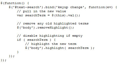
Please note here a call has been added to clear text highlighting that performed outside the empty field check while on-page text searching. All this help in removing the highlight when user clear the text fields. Unfortunately, the removeHighlight() support almost every web browser except Internet Explorer 6 due to IE6 bug with node.normalize().
Replace the codes in line number 45-53 of highlight.js with following set of cods to make the Highlight plug-in work properly in IE6:

Download the complete example to check out the final results go live.
3.Full-Page Slider
At present, the sliding animation is considered one of the most interactive way to present web content on the website. Here is an example of amazing sliding animation. JAX Vineyards has taken advantage of sliding animation by animating the standard sliding gallery across the entire webpage. Below, we are going to create a similar “full-page slider” effect by using jQuery.

Let’s get started with the mark-up first :

Here, we have completed with set-up of basic mark-up and wrappers required especially for the animation effect. Please make sure that the full-slider-wrapper should not include any element narrower than web browser window. The reason is simple – we require full width of web browser for the effect.
Below is the some basic set of CSS codes essential for handling the overflow and position of the panels:
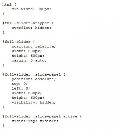
By this we end up with defining positioning and complete set- up of some dimensions of the panels and wrapper. Please note that overflow: hidden has been attached to wrapper element which help in appearing scroll bars while animating the panels. Since, we have hide overflow and therefore, we need to assign min-width to HTML document so that content on web page get scroll bars incase window of web browser is too small. At the end, the active class has been used in the mark-up just to display first panel.
Codes for jQuery Animation
Here, we are going to start with defining variables. Further, we will create a function for sliding animation in both the directions effectively:
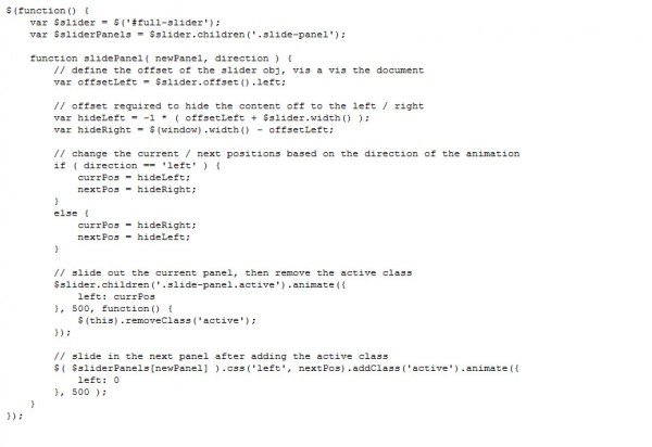
By this, we are end up with slidePanel() function which accepts mainly two arguments – panel index for slide to view and slide direction either left or right. Here, we have simply decided offset amount required to hide panels on both left and right directions. Next, animation has been triggered by using jQuery’s animate() and slide active panel out of view and removed active class after animation get completes. It’s time to set the new panel’s left position off the screen and attach active class to make it appear as well as slide properly and effectively into place.
The next thing we are going to work with is to create controls for our function handling animation. Now, add navigation elements to the previously defined slider object:

You can also include the navigation elements in initial mark-up but the reason behind mixing it with JavaScript is simple to make sure that navigation doesn’t appear until JavaScript get loaded and keep navigation displayed on the off chance that JavaScript isn’t enabled.
Following are the codes for styling the navigation:
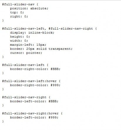
Below set of codes allow you to attach new slider navigation to previously defined slidePanel() function:
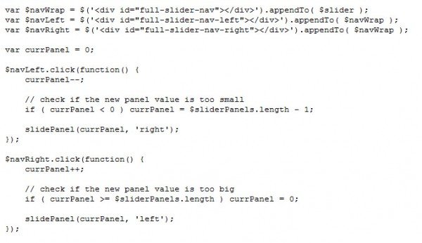
With the help of this snippet, we have assigned click events to both left and right navigation but remember to change value of currPanel according to the direction. Loop to the other end in case new value falls outside available panels. Now, the slidePanel() function will be activated with new panel and appropriate direction. Please note that here we have created controls for left and right navigation but it can be corrected easily to build buttons for each panel. Simply pass right panel index to slidePanel for the same. Now, we have put jQuery code together:
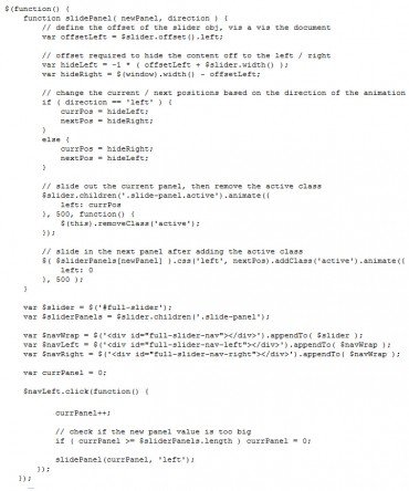
You can even Download the complete example of Full Page Sliding Animation.
4. Amazing Vertical Sliding Navigation
At present, most of the websites are driven by latest trend of sliding horizontal menus or Coda Slider effect generally used corporate designs. The horizontal sliding navigation is perfect option for websites where product have dominant positions in the design layout. But, Kobe have used the similar sliding navigation trend in completely different approach.
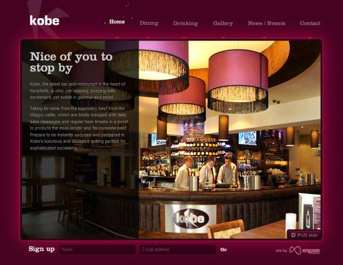
Here, they have applied animated sliding navigation beautifully at the top of the website where the main website content area slides vertically after the background image. It is the best example of horizontal navigation used creatively and intelligently to make visitors distinguish easily between both primary and secondary navigation. The best part is that content blocks load up front only when webpage get loaded.
It seems that the webpage has been animated effectively. This design is a complete CSS+JavaScript based solution. It’s really tough to navigate this web portal if JavaScript stops working and this is one of the major issue with the design.
Kobe has taken the advantage of CSS sprites to create horizontal navigation at the website top. Please note that here almost every navigation option has been well packed in a single image and this CSS sprites chunk is selected via background-position-attribute. Surprisingly, CSS sprite are transparent .gif :
Here, the right use of JavaScript has been applied to define the position of animated sparks.

The main content area in a website include background image and a semi transparent overlay-layer used perfectly to present related content where overlay-layers load only when an appropriate navigation option will be selected.
5. “Drag and Drop” control bar For Oversized Content
It’s always difficult to find out quality solution when it comes to a layout that includes large images. Mospromstroy is a beautiful website where a a “drag and drop” control bar has been used that allows visitor to pan through images appeared on website. Here, we are going to do the same by using jQuery UI’s draggable behavior.
Basic Mark-Up and CSS
First of all, we are going to create mark-ups for the content and controls:
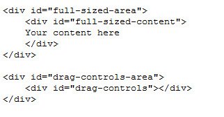
Some basic CSS:
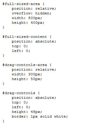
Here, we have simply applied an absolute position to #full-sized-content and #drag-controls. Besides that, we have even hide overflow from the large size image. On top of that, some arbitrary dimensions are applied to content and drag controls wrappers that can be changed further as per requirement. Now, we are going to create interaction by using jQuery UI.
We will resize drag control box to the right dimensions before start working with controls :

Scale width of the control box after defining visible portion of the content in particular content area. Attaching draggable behavior is the next thing we are going to do:
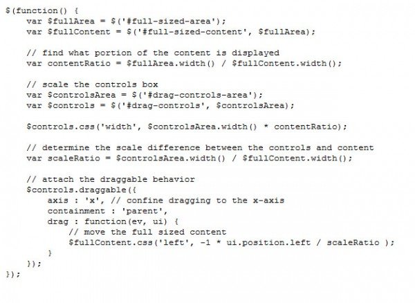
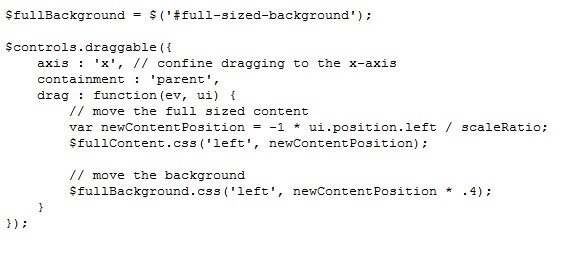
After attaching draggable event and other options, we need to set axis for making dragging to the x-axis restricted. Apart from that, containment needs to be set to confine dragging to the parent element basically controls wrapper. By this we end with the set up of a drag listener that help to move the full-sized content.
Custom Cursors
N ext, we are going to add some more styling to the control box in order to make it more interactive. Here, we use two class names – ui-draggable and ui-draggable-dragging:

Interestingly, this snippet help to apply a new border color to the active controls and attaches a number of cursor properties (which use proprietary UI cursors generally available in Firefox and Safari. Note that we need to bootstrap it by using !important so that the proprietary cursors can be used only if available. The reason is simple – we have implemented the cursor property.
Parallax Effect
Now, we are adding two-layered parallel effect to make the three-dimensional sliding animation. Add the background to full-sized content area but don’t forget to animate it with slower rate.
Copy and paste the below set of codes first:
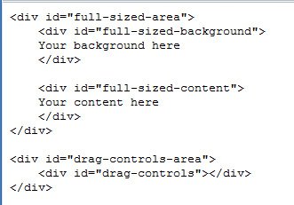
Some basic styling:

Here are the codes to add background animation to drag event:
You can easily Download the complete example and use it creatively in your website.
6.Amazing Neighbours navigation
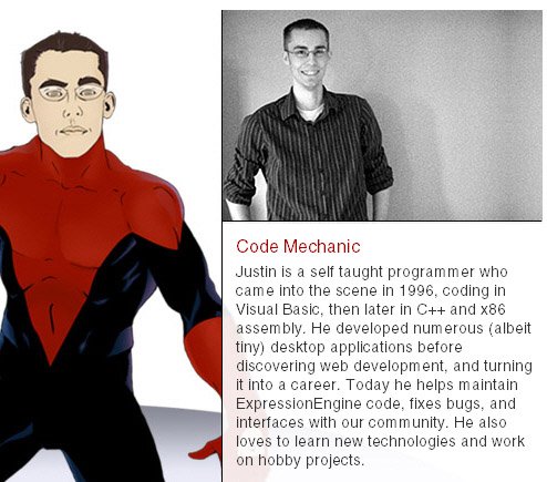
EllisLab is a website where you can see really interesting and unique design approach used perfectly to show team members. Here, intuitive primary and secondary navigation menus have been placed one after another with small thumbnail, esoteric cartoons and brief description of team member instead of old boring way of listing names next to each other.
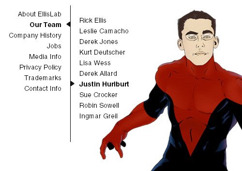
The best part is that they have intelligently make the use of arrows and color indications at both primary and secondary navigation menus to guide users where they are at the moment. Here, both the menus are divided simply via a sharp vertical line. Note that the whole content area in the web portal is divided mainly into two portions — primary navigation at left side, and the content block at right side.
In the website, the use of semi transparent background image has been made simply for the description appear on the right-hand side. They have defined background-images via CSS for the content block and applied via IDs. We find it really simple yet elegant solution for navigation.
