 Webgranth
The current trend is leaning towards mobile devices and hence Google’s message is not surprising. The entire industry is now moving to mobile. Testing a mobile algorithm is under way and based on current trends, nearly half of all paid clicks are expected to come from mobile devices. The sites are optimised for mobile with more and more content available for all users.
Difference between Responsive and Adaptive Design
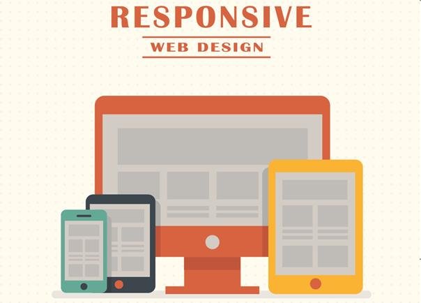
Responsive design is fluid in nature and adapts to the screen size irrespective of target device. Responsive makes use of CSS media queries to change varied styles based on target device attributes to adapt efficiently to different screens.
Adaptive design uses static layouts that don’t respond once loaded. Adaptive detects screen size and loads the appropriate layout especially for six common screen widths. On the surface, adaptive might appear to require more work with design layouts for at least six widths. However, responsive can be extremely complex since incorrect media queries can create various display and performance issues.
- A responsive site is not going to be as quick as any dedicated mobile site.
- Adaptive design is useful for retrofitting existing sites for making them more mobile-friendly. This allows you to take control of design and develop for viewports. One can make more informed decisions by referring to web analytics for developing the viewports.
- If you want to design adaptive sites from scratch, one can start with lowest resolution and then use media queries to increase the layout for high resolution viewports.
What Does This Mean to My Website and Business?
Web developer circles talk about accessibility of websites on varied devices. The recent Google notification meant that sites that are not mobile-friendly will need to get the ball rolling quickly to make search engine results matter to the site.
Capturing mobile leads with 80% of users accessing through mobile devices, one needs to leverage mobile traffic? One can capture immense number of leads using mobile-optimized web-forms. One can then able to nurture leads using email marketing and marketing automation.
Advantages of using Responsive Web Design (RWD)
- Responsive Web Design is an approach for crafting sites to create an optimal viewing experience and navigation with reduced resizing, panning, and scrolling across multiple devices including mobile and desktop computers.
- The layout will automatically respond to the similar size. Responsive websites can work well for content-heavy websites since not much change can be witnessed between user intent between mobile users and desktop users.
- One of the great advantages of responsive design is that it includes a single codebase for a website that can attend to all platform users.
- Instead of two separate versions, a single responsive site can do the trick. Responsive design is heaven for developers and for marketers, it is a unifying strategy for analytics, strategy and deployment.
- A responsive website can deliver one set of analytics along with a single strategy too.
Advantages of Adaptive Web Design (AWD)

Adaptive Web Design does not use one layout but there are several distinct layouts for setting up with multiple screen sizes, and the layout is dependent of the screen size. It tends to a specific layout for mobile phones, tablets, and desktops. These three designs are on standby depending on the visitor and the device in use, delivering the pre-set layout for a particular screen-size. Several programs will be used for different versions of a webpage to optimize the page for different devices.
Adaptive delivery allows businesses to accomplish a highly differentiated experience especially for mobile customers. AWD allows you to specifically capture the exact user intent precisely on a mobile device, to engage with the business in specific ways that is different from desktop website use behaviour. Local businesses may want to build mobile versions of the site to cut out superfluous information and make it easily accessible.
Here are some salient differentiators between the two approaches:
- Responsive is Harder to Make than the Adaptive Design.
- Adaptive layout needs flexibility to work on multiple screen sizes and match user’s intent.
- Adaptive design Needs Maintenance and Pre-written scripts while Responsive site designs can work well on any screen size.
- Adaptive Sites load faster than responsive sites most of the time since they are optimized for screen sizes with smaller images. The load time is saved in this regard.
User preferences for accessing websites would be through mobile devices irrespective of the method you choose you use, as long as the site loads fast enough and the navigation is pretty smooth.
Author Bio
Keval Padia is a Founder & CEO of Nimblechapps, a fast-growing iPhone application development company. The current innovation and updates of the field lures him to express his views and thoughts on certain topics.

Comments
0 comments