Studying the data and information from long thesis, mega structure books and colorless sheets is really a boring and tough job. When we are encountered with these means of information collection we just pray to see the last page of it as soon as possible. To save the world from the tortures of these encounters some creative and super intelligent designers offered a new way of learning the sophisticated data. “Infographics” was the name assigned to that savior.
Infographics are the way to fusion the maximum possible information and figures in a colorful, creative and easy to understand fashion. It is basically the visual representation of long information and numeric data by using pie charts, line charts, timeline and artistic pictures. Infographics are eye catching and provide you the information in a super cool manner.
Below is some of the best array of infographics we had searched from 999999 results to enhance your data figures.
Web Designers vs. Web Developers
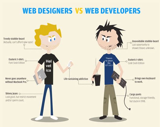
Web designers and web developers are the Tom & Jerry of our web network. They both need each other but they both want to prove their dominance over each other. This infographic will showcase the cold war between these two fighters to get the medal of “Mr. Super cool”.
![]()
Online Community Map

Which online community is more popular over the rest? Do you think that Facebook and Twitter are the only boss competitors? Which is most shared page Farmville or YouTube? Check out the answers of all these questions and lot more interesting and surprising figures with this online community map.
![]()
The Biggest shift Since the Industrial Revolution

Google is the largest search engine on the web today; but do you know who the nearest competitor is? What is its growth per week? What are the present Facebook statistics? Watch these out in this eye candy infographic.
![]()
Fastest Way to Lose Customers

Business is basically a game of satisfying maximum no. of customers by your services. This interesting visual represent the most common reason your customer have, to leave you. It provides you the appropriate figures of the total average cost of losing a single customer and a lot more additional facts.
![]()
Google Page Rank
![]()
Every website developer aims to make his website most SEO friendly so that it can get maximum no. of visitors. But the criteria algorithm to rank a website page by Google is a mysterious puzzle. This useful infographic represent the peak factors that can enhance the visibility of your page.
![]()
Good Information design
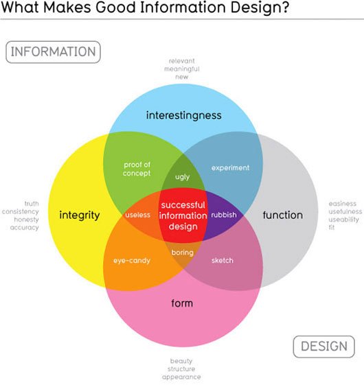
Definition of an ideal Information design has been always a never ending topic of debate. It is really hard to give a confident answer about the quality or result product of an information hierarchy. However this Infographic representation is a simple and attractive pie chart view to summarize the vital parameters of a good information design.
![]()
How does Colors affect purchase?
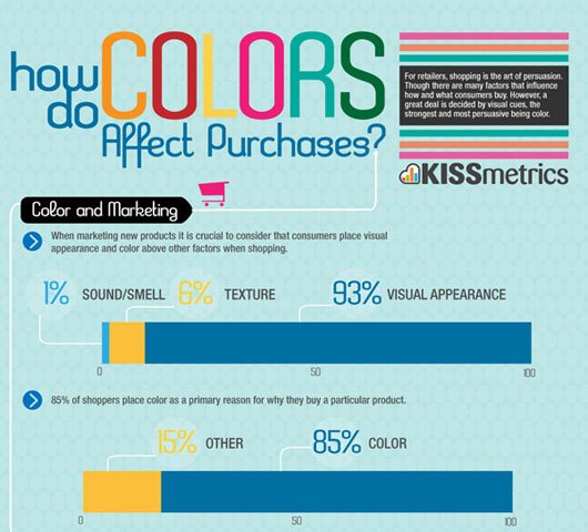
Buying and selling is a very functional process since the early stage of human civilization. The visual interface of an article is the prime factor to look upon while purchasing an article. But what are the factors that constitute this visual interface? What is their effect on the article sale? Which color is in the peak demand these days? This infographic is a bundle of all these answers and a lot more add-on data.
![]()
Freelance to Freedom
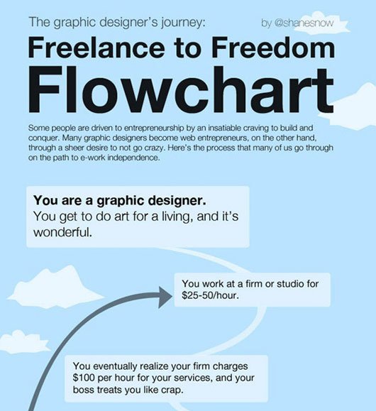
Graphic designing is a purified art of transforming even the ugly stuff into a masterpiece. When you start working for someone who is feeding you a salary just 0.1% above the govt. Prescribed poverty level and wants you to give a 700% work result; your own life starts looking ugly. At this stage he may decide to work independently. This infographic is a real movie of the circumstances and hurdles that a graphic designer faces in the starting of his career.
![]()
The Colors of the Web
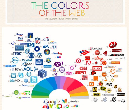
Our internet world is full of colors; red, green, blue, purple, orange …….. and millions more than what we can even imagine. But have you ever thought which color is mostly used by the mega brands? Facebook, window, AOL, Skype and a lot more are using blue whereas BBC, ESPN, VLC, Vodafone, Ask and many more are using red. So blue and red are the only competitors? Let’s check out the answers of our every query in this amazing infographic.
![]()
HTML5
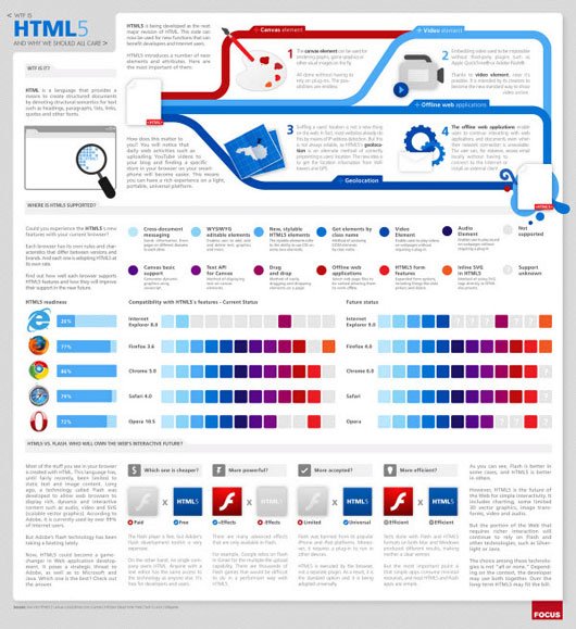
Hyper Text Markup Language is also known as the ‘language of developers’. It is used by the web developers to create web pages. The latest version of this language is HTML5 which offers you exciting new features like <audio>, <video> and <canvas> elements. This new version liquefies the complicated tasks of a web developer and hence saves the time. This infographic update you with all you need to know about HTML5 in an easy and interactive manner.
![]()
These infographics are full of creativity and information to make you learn the complicated datagram in a playful manner .We hope that the above collection of best infographics will sharpen your knowledge. Get close to us for more amazing technical trends and useful tools.