The design layout of a donation page should be simple enough to state the basic ideas needed for receiving healthy contributions from people to run the sole purpose of your organizations.
Generally, donors wish to see standard piece of information with which they can easily relate and find their cause. Whenever a donor arrives at a donor page, he should easily get to know about the goals of the mission, objective behind the organization, earlier actions, work accomplishments, and use of donation amount. By mentioning all these points on a donor site, you can earn many possible donors and if someone fail to mention these important points in a donor site then it is obvious to expect fewer donors for your site. A donor should be fully aware and convinced about the cause for which he/she is spending money.
Basic Elements to Design an Effective Donation Page
In order to design a donation pages it is important to stress over certain basic elements to design them effectively. Missing any of the elements can cost over the performance of your website. The design of the donation page has to be very attractive with an eye-catching title to attract the donors to go-on with reading. It is important to incorporate relevant images to convince the donors about the root cause of the organization. It is important to specify how the money of the donation is going to be used by conveying the mission. Sharing e-mails is nice way to spread over the various issues and causes; social media is also a great effective factor to do so. The donation website should be simple enough so that every user can easily use and connect through it. It is better to built up the participation and trust of the people through a concise form. Building a strong privacy policy is also a great factor that ensures the visitors about the safe future of the organization.
Being web designers and developers, we have wisdom to view to look over the web pages in a different manner. Due to our profession, we are bound to produce fine, finer, and finest kind of work to express the motive of the site. The major source of inspiration for web designers is the artwork and design pieces created by others on web pages through which we source out the best work to design donor pages for various organizations.
The basic consideration to design donor pages is the essence of the charity, cause, and call for action. To make you understand better we have tried to gather few of the best examples for you of donor pages from all over the world. These are the top rated donor pages designed by the eminent designers from global industry of web designing and development. Let’s have look at the most extravagant designs of donor pages.
Below we have provided a showcase of 15 most eye-catching donation pages from all over the globe with a brief description of every web page design.
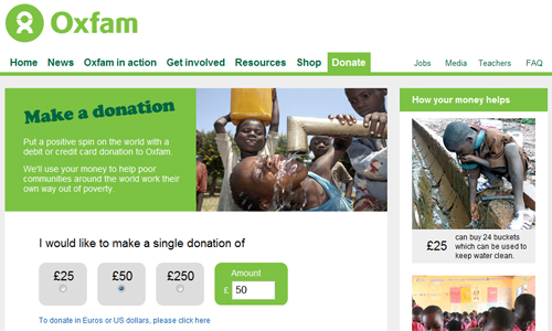
Oxfam
Oxfam is an organization that focuses upon the mission of supporting people all over the world. This site has created donation page while focusing over necessary mission to call the visitors and readers with various kinds of donation amounts.
Manna FoodBank
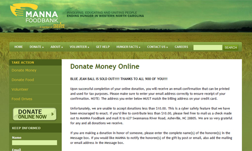
The donor page of Manna FoodBank has been made by utilizing natural earthy tones of colors that also spells the cause of the site very well. This site has been created along with a call for action button at a prominent place with slightest changes in the colors.
Save the Children
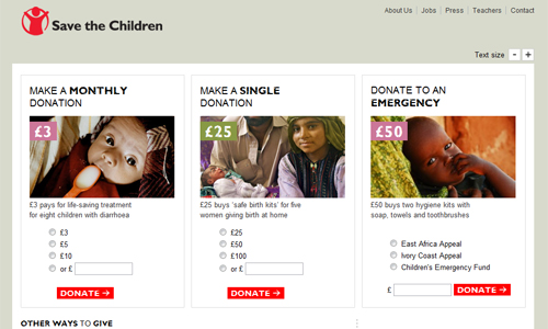
The donor page designed for the organization Save the Children is designed with a sleek design with nicely chosen avenues for help the user to donate. The page is designed with much kind of actions for its users which has been designed in a great manner.
Operation Warm
Operation Warm is supported by a very nicely created site with soothing and comfy colors. The page is designed in variety of matching colors that blends well with the majority of the site. The call for action button suits the site even with a choice of various colors.

Red Nose Day
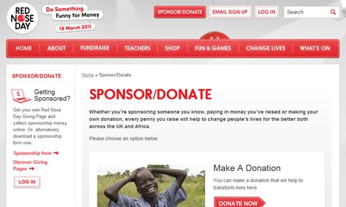
The Red Nose Day is a site which has been designed using two majorities of colors red and white. The red color describes the donation theme and the base of the mission in a manner that people take action for the cause.
American Heart Association‘s Donation
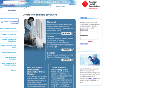
American Heart Association‘s is supported with a well designed donation page in a stylish manner it is a site that focuses gaining the attention of the maximum users directly to serve the mission of the organization.
Network for Good
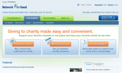
Network for Good is another donating organization that has a wonderful design with three different courses of actions that can be easily focused by the readers. Every button is prominently placed that catches the attention of every person.
Make-A-Wish donation
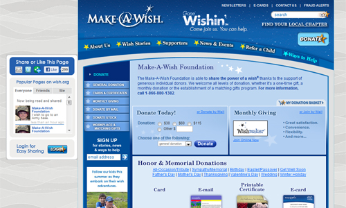
The Make-A-Wish owns multi-faced donation page with wise use of colors and construction.
Kiva
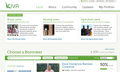
The Kiva site’s donation page has been designed in a spiky and focused manner. This great landing page is focused on tracking upon the multiple routes of catching over the helping hands. It is designed with large bold buttons to accumulate donating helps with action button placed prominently.
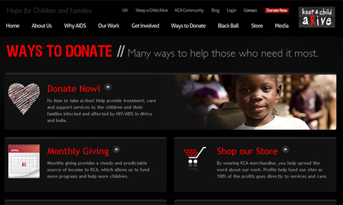
Keep a Child Alive
The Keep a Child Alive organization is supported by a sleek design with prominently large button to call for contributes for the mission. This site has been designed with tattered effects to keep alive the cause through designs.
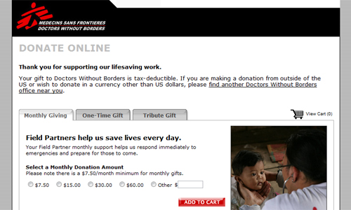
Doctors without Borders
The Doctors without Borders association is great body concluding free help to people in need. The donor page of this organization has been designed by utilizing tabbed windows for separating the paths that users can relate. The all over design is simply attractive and sober.
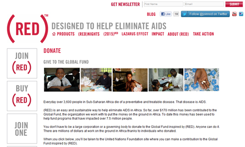
Red
The donor page of Red has been designed while keeping the idea of minimalism in mind collaborated with stylish levels of buttons. The typefaces used largely to specify the important elements of the site and drawing attention towards it.
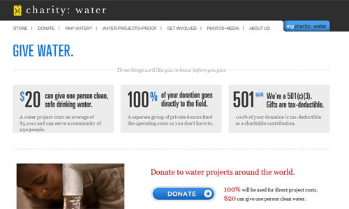
Charity: Water
The donor page designed for Charity: Water‘s is a piece of design crafted focusing over the mission of the site. The design is simple and focused on the attracting maximum number of people to serve the cause.
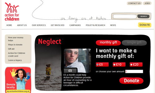
Action for Children
The page to donate designed for Action for Children is catchy design with large picture and text to stress over the cause. The call to action button is designed beautifully that spells the sincerity of the donation cause effectively.
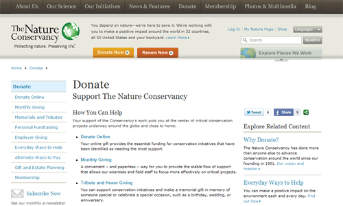
The Nature Conservancy
The donor page of Nature Conservancy is designed in a simple way this is one of the sleek page designed for donation. The donate button is at the top of the navigation menu, where user majorly roam around.
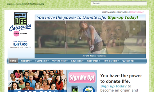
Donate Life California
The donation page designed for Donate Life California is a capricious design with a prominent pink button to denote call for action.

Comments
0 comments